Thursday, 31 May 2012

Textures


Looking at the work of SHAUN TAN, I thought that one of the ways that he might’ve achieved the old stained look of his graphic novel “The Arrival”, is that he created the textures separately and then applied them to the work after they’d been drawn.  So I decided to experiment with some textures of my own.

I used Winsor and Newton watercolour paper for these experiments and 2 different kinds of tea (all in the form of tea-bags); PG, Rooibos and Tetley’s. I dedicated an A5 sheet of watercolour paper to each of the different teas and lay wash after wash of tea on the paper (which I kept in a tea tray to minimise mess and to allow myself to apply freely) allowing time for each layer to dry and using both full paper washes and just splashes.
The results were that the Tetley’s green tea was the most subtle. It was very light and not nearly as strong in colouration as the Rooibos and PG. The strongest was PG closely followed by Rooibos (which left a slight red colouration on the paper).

I then took the tea bags out of the cups and opened them onto a longer piece of paper. I kept the tea leaves from each of the bags in their own little columns to find out what would happen to each of them. I rubbed the leaves into the paper, added a little water, put another piece of paper the same size over the top, and left it there overnight. The resulting texture was a sort of cloudy effect and, where the Tetley’s was the weakest when staining with washes, the tea leaves created the most impressive texture.

After I’d set up the tea bag experiment, I decided I’d try something different to make use of the leftover tea. I crinkled up a piece of paper so that some parts would sit above the tea level and others below. The tea I used was a mixture of PG and Rooibos, so that I could get the slight red-brown of the Rooibos but also the strong colour of the PG. I found the result to be very aesthetically pleasing.

Later I decided to crinkle up some paper to see what textures I could get from that. The result is multiple feathered creases (due to the thickness of the paper it didn’t create any clean edges; something that I think made it easier to cover the paper).

I thought about applying these to my comic to enhance the feel of it, mostly when portraying the protagonist as these textures seem dirty, gritty and would appear like a blemish. However then that lead me onto the train of thought of what I could do for the new guy, and I decided that it would probably be a good idea to create some patterns to overlay and show his influence more as well has enhance his brighter colours. As of yet I have nothing but I plan to experiment with some patters soon. I think I might do an A4 sheet of patterns so that I can overlay the bits that I like and keep reusing it in different ways but have a continuous style. It would also save time.

Monday, 28 May 2012

Colour Research


I decided to research some artists so that I could get an idea of what the colours could be like. I knew that I needed an artist for brighter colours, and another for more depressive colours. I focused on the abstract art of PETER DRANITSIN ( http://www.petesoriginalart.com/ ) for a look into dramatic and bright colours. The pieces I researched were the most recent when I found his website, but I love what he’s put up as of late. It’s a very different approach from his other pieces. The paint is not as thickly applied. Closer to Earth (http://petesoriginalart.com/closer-earth-p-1042.html) and Here on Earth (http://petesoriginalart.com/here-earth-p-1035.html) are my two favourites of his new ones.


I looked at the colours he used and how he applied them in the pieces “Ocean Gates”, “Beyond Your Fantasy” and “Message From My Heart” and tried to mimic the colour schemes and the ways they merged and were applied in my sketchbook. Dranitsin says on his website that he uses liquitex Acrylic and different kinds of tools to create his pieces. I didn’t see the point in using different tools as I was really only studying his works for the colour, not the texture. I would do the same thing if I redid it. I didn’t have any Liquitex Acrylic available, nor did I know where to get it so I stuck with the usual Acrylic.

I find Peter Dranitsins works to be very dramatic and expressive. The colours he uses are powerful and any textures he creates with them only enhance the effect. For example, In “Ocean Gates”, because of the way the copper colours appear to be raised from the surface and the blue appears to be at the lowest point of the picture, it looks like (in my opinion) a tropical island, with shallow waters where the copper thins a little into the blue.  Again in “Message From my Heart”, the white in the middle still looks liquid and the smudged black at the edges looks broken this indicates, again, a thick application of paint. However this time it looks like the thick paint has been put over the entire canvas. The way the centre of the piece has been done (the crispy looking black centre with smoky white) it looks like something is burning. I’m not sure if this was intentional but it gives me the sense of lava/magma.


 ( Top to Bottom "Red", "No.61" and "Number 14")

Another artist I decided to look at was MARK ROTHKO whose most notable large abstract pieces of blocks of colour apparently seem to have varieties of the colours appear to be floating within (something I think I’d like to see in person should I get the chance). I looked at these because I had the idea of using my research on colours that these artists use as colour palettes for my own work (as I am thinking about colouring digitally to save time and to be able to experiment easily with different colours). I wanted to get a similar feel to what I found (via google images as I don’t have the time or money to go and view the original works) so I used oil paint to experiment. I have to say that I love how vibrant and full oil colour can be compared to Acrylic.

To me, his work looks like large swaths of colour on a smooth slate, maybe pottery. I think it’s because they seem so 2 dimensional and flat, but the background colour feels like it’s something more than just a canvas. It’s as if it has the privilege of holding swaths of the very essence of the colours. Or perhaps my imagination is running a little wild. But the works seem to be completely about colour and that’s something that I don’t think I can link with other artists.


For the more solemn colours of my story, I looked at some of PABLO PICASSOS blue period paintings. It’s not the subjects I’m interested in but how he has managed to use so many shades of blue without obscuring anything. I don’t feel that I can say much more than what the paintings say (left “The Old Guitarist”, right “Las Dos Hermanas”) as the colours and the posture of the figures tells the whole story. The blues show a sadness, grief and it would seem that the figures have lost all hope. The guitarists hands are frail and limp and his face shows a sort of depression; his sunken, shadowed eyes are the most prominent. But the “giving in” attitude that can be seen from this picture is mostly in his hunched posture and the fact that he seems so relaxed that he might’ve resigned himself to death if not wishing it were here sooner.
The Two Sisters  comforting one another after a sad event. You can see the same resigned look in the right sisters eye.


In order to try and apply these colours to my work I’m planning on creating a single panel (probably a room scene as it’s more versatile that a human face where expression is needed to show life) and then colouring it multiple times digitally.

Albert Uderzo


I find the style of Albert Uderzo (co-author and the illustrator for the Asterix and Obelix stories) to suit the target audience (children) exceptionally well. The roundness of the lines and the bright colours are attractive and friendly and the expressive natures of the characters vastly entertaining and key to each of their personalities. There is also a sort of caricature-like appearance to the designs which is possibly due to the exaggerated features (the most obvious ones being the nose, hands and feet) but the style is believable because Uderzo has taken the anatomy and rules of the real world and applied it as a structure beneath the wondrous expressions of his characters. The most obvious sign of this is in his backgrounds and buildings which are the most “realistic” in appearance. I say realistic in quotation marks as it still seems to fit within the world he’s created.

I experimented with a couple of different characters from some of his books in an effort to mimic and better understand his style. The first 2 drawings I did (top of the page) were done with a usual pencil however the rest were done with a mechanical pencil which I found to be much better in terms of detail and accuracy, it also allowed me to put in many more sketch lines (What I usually do when sketching is to use multiple lines instead of the bare minimum) without losing the shape of the drawing
.

Looking at the lines and subtle marks in colouring, I figured that Uderzo might’ve used brush and ink to create the lines, and watercolour to colour, though not thick watercolour paper because there was no sign of texture.
I chose the drawings I thought were most effective and inked them with a brush and Windsor and Newton black Indian ink. I then after I was sure they had dried properly, I coloured the lines with watercolour (the type you get from a tube, not a block) and made sure to test the colours I made before applying it to the image. It was then that I discovered to my dismay that the water activated the ink again and made it runny, bleeding into some of colour and de-saturating it. I tried to avoid contact with the lines after this discovery, wanting to finish what I started, and was able to create some outcomes that I’m very proud of. In order to make the white horse appear white, I put a light shade of yellow around the outside of the horse to have something for the eyes to compare with.

Later whilst mark making with Indian Ink, I remembered that I had a bottle of Windsor and Newton Black Calligraphy ink as well, and also experimented with it. As I wrote in my sketchbook, I found that the Indian ink is much more versatile in the amount of marks and textures you can get with it, however Calligraphy ink is much more smooth and easier to create clean brushstrokes.
I first tested that the Calligraphy ink would not reactivate with water before taking another one of my other sketches and inking it, this time with Calligraphy ink. When colouring it, I found that the ink didn’t bleed and came up with a slightly brighter, cleaner image than the other two (horse and red-haired man (Anticlimax) were drawn with a mechanical pencil then inked with Indian Ink. The little blond haired fellow (Asterix) was drawn with a normal HB pencil and inked with Calligraphy Ink.).


The most important things I learnt in terms of materials were:
- Mechanical pencils are more accurate than normal pencils and are forever sharp.
- Watercolour is best used from tube rather than blocks so that you can mix them better.
-         - White ink can be very useful for hiding accidents ( I had a few over the line colouring accidents, I think I was trying to go a little too fast. I used white calligraphy ink to colour in the eyes. To hide some watercolour hiccups, I had to add 1 or 2 layers of water colour ink. Use a very thin brush and a little at a time.)
- USE CALLIGRAPHY INK for lines, NOT INDIAN INK.


(The books I copied the drawings from were Asterix the Gladiator (top two, Cacophonix and the lioness) and Asterix in Britain (the rest). The Asterix picture can be found near the beginning of every Asterix and Obelix book.)

Monday, 23 April 2012

16 - 22 April 2012

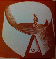
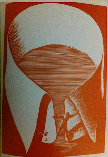
This week was spent having a look at comics (or sequential art), as a style, in depth and some of the different styles and art mediums used.As I'm planning on doing a silent comic, two of the artists I looked at were silent story tellers:  Giacomo Patri "White Collar" and Shaun Tan "The Arrival".

 For an understanding of the medium I wanted to work in, I read "Understanding Comics: The invisible art" by Scott McCloud. This book (which I was lent) was so enlightening and interesting that I thought I'd go buy a copy for myself. The information and analysis of Sequential art is exactly what I felt I needed. It shows how though comics have been labelled as the worlds of superheroes and villains, it's actually so much more! And that it shouldn't be judged on that small section of it at all! McCloud also offers some history of the medium which I think I might follow later on. I would strongly recommend this book to anyone who wants to go into the same medium as it's a good starting point and gives you an insightful view onto the whole subject.

Notes on the book can be located in my Sketchbook.


Giacomo Patri " White Collar"

From what I can tell from the story, it follows a man trained as an Advertising Illustrator in the time of the great depression. It shows him and his family as they try to survive in the economy. Being fired from work, not being able to find a job, trying to work freelance but not getting enough business to pay the bills, starting a business but being driven out by a chain store, his wife getting pregnant during these times when money is tight and how they're not able to afford secret abortion (as it is against the law). All the while walking past protesters time and time again. Ignoring them.

 I think the images at the beginning of the story really sums up what most of it was about. He was so blind to the warnings, so insistent that he was above the working class that eventually he ended up jobless, homeless and just trying to survive.

It was only at this point of complete loss of hope that he accepted what had happened and what position he was in and left the confines of his blind mindset in one of the final images.

The entire story was made from linocuts. According to the book  "Graphic Witness" by George.A.Walker (from which I found this graphic novel) a V shaped blade was used to carve the series of prints. I can understand the style of the piece due to the medium. It would be hard to use a style which incorporates the use of detailed, fine lines. Therefore the lines are chunkier and the shading a cross between strong contrast and silhouettes, and the use of lines (to show a more gradual shading).

Patri also integrates the use of colour into his work. His more literal scene in a black and white, and the more emotional, abstract scenes in a red-brown and white. White is always present as I think it can be used to link the pieces together, as well as make it simpler to use.


Shaun Tan "The Arrival"

The story is easy to follow and incredibly captivating. It uses 3 different kinds of panels. Small panels side by side, usually square shaped but that changes from time to time, single page panels and double page panels. The small panels provide the bulk of the story, with the other two types creating big impacts. The single page panels are notable events, memories that form part of the story, the double page panels usually set a scene, and are much more dramatic in what they show. Size being a major part of the role they play.

I love the realism meets abstract theme in this book as it seems appropriate to what it describes; The familiar meets the unfamiliar. But by using an abstract style to describe the new world, it makes the story fully accessible to everyone as none of the elements seem to relate to any known nation.

The lack of colour makes you focus more on the shapes and content and because it's in a realistic style, makes it easier to read that if it was coloured (psychological reasons explained at the bottom of the page).

Perspective and expression is also used in a realistic manner for the people, so the strange and wonderfully intriguing shapes and designs of the abstract creatures really clashes. However, I think the book being in black and white also helps to break the separation barrier and make them more believable.


I copied a panel of "The Arrival" as well as copy some figures from the Asterix and Obelix books illustrated by Albert Uderzo in what I think is ink and brush and watercolour. Although at the moment they are in penicl, I plan on inking over them and colouring them in the same way soon.

(You see the world in a realistic way because you can see it with your eyes. However you have a sketchy, simple awareness of yourself because you don't always see yourself. Therefore you would relate more with simple styles and separate yourself from realistic styles.