For an understanding of the medium I wanted to work in, I read "Understanding Comics: The invisible art" by Scott McCloud. This book (which I was lent) was so enlightening and interesting that I thought I'd go buy a copy for myself. The information and analysis of Sequential art is exactly what I felt I needed. It shows how though comics have been labelled as the worlds of superheroes and villains, it's actually so much more! And that it shouldn't be judged on that small section of it at all! McCloud also offers some history of the medium which I think I might follow later on. I would strongly recommend this book to anyone who wants to go into the same medium as it's a good starting point and gives you an insightful view onto the whole subject.
Notes on the book can be located in my Sketchbook.
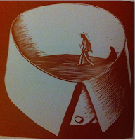
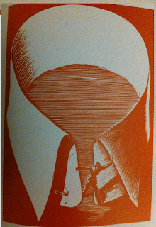
Giacomo Patri " White Collar"
From what I can tell from the story, it follows a man trained as an Advertising Illustrator in the time of the great depression. It shows him and his family as they try to survive in the economy. Being fired from work, not being able to find a job, trying to work freelance but not getting enough business to pay the bills, starting a business but being driven out by a chain store, his wife getting pregnant during these times when money is tight and how they're not able to afford secret abortion (as it is against the law). All the while walking past protesters time and time again. Ignoring them.
 I think the images at the beginning of the story really sums up what
most of it was about. He was so blind to the warnings, so insistent that
he was above the working class that eventually he ended up jobless,
homeless and just trying to survive.
It was only at this point of complete loss of hope that he accepted what had happened and what position he was in and left the confines of his blind mindset in one of the final images.
The entire story was made from linocuts. According to the book "Graphic Witness" by George.A.Walker (from which I found this graphic novel) a V shaped blade was used to carve the series of prints. I can understand the style of the piece due to the medium. It would be hard to use a style which incorporates the use of detailed, fine lines. Therefore the lines are chunkier and the shading a cross between strong contrast and silhouettes, and the use of lines (to show a more gradual shading).
Patri also integrates the use of colour into his work. His more literal scene in a black and white, and the more emotional, abstract scenes in a red-brown and white. White is always present as I think it can be used to link the pieces together, as well as make it simpler to use.
Shaun Tan "The Arrival"
The story is easy to follow and incredibly captivating. It uses 3 different kinds of panels. Small panels side by side, usually square shaped but that changes from time to time, single page panels and double page panels. The small panels provide the bulk of the story, with the other two types creating big impacts. The single page panels are notable events, memories that form part of the story, the double page panels usually set a scene, and are much more dramatic in what they show. Size being a major part of the role they play.
I love the realism meets abstract theme in this book as it seems appropriate to what it describes; The familiar meets the unfamiliar. But by using an abstract style to describe the new world, it makes the story fully accessible to everyone as none of the elements seem to relate to any known nation.
The lack of colour makes you focus more on the shapes and content and because it's in a realistic style, makes it easier to read that if it was coloured (psychological reasons explained at the bottom of the page).
Perspective and expression is also used in a realistic manner for the people, so the strange and wonderfully intriguing shapes and designs of the abstract creatures really clashes. However, I think the book being in black and white also helps to break the separation barrier and make them more believable.
I copied a panel of "The Arrival" as well as copy some figures from the Asterix and Obelix books illustrated by Albert Uderzo in what I think is ink and brush and watercolour. Although at the moment they are in penicl, I plan on inking over them and colouring them in the same way soon.
(You see the world in a realistic way because you can see it with your eyes. However you have a sketchy, simple awareness of yourself because you don't always see yourself. Therefore you would relate more with simple styles and separate yourself from realistic styles.
